

Discover the essence of Amazon Storefront banners and their pivotal role in captivating potential customers. Learn the optimal size – 3000 pixels wide by 600 pixels tall – for seamless integration and stunning visual impact. Uncover expert tips for crafting compelling banners that reflect your brand identity and drive sales
Posted Nov 9, 2022
•
8 min read

Business, Design, Graphic design

Create beautiful marketing graphics at scale.
10 Worst and the Best Fonts To Use On A Resume
Listed below are the top worst and best font for a resume.
What Is The Best Font for a Resume?
Here are the top 10 best font to use for a resume:
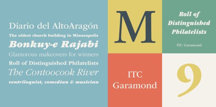
01. Garamond – Best Font for a Resume
As we all are well aware, Times New Roman has been the most popular font. This is the very reason one must refrain from using it. A good alternative to the font Garamond. The precursor has been used for around 500 years and has the benefit of giving the resume a classic, polished look making it much more interesting compared to the overused Times New Roman. The font helps fit more text on a page without sacrificing the readability by lowering the size of the font.
02. Gill Sans- Best Font to Use for a Resume
Gill Sans is a simple, sophisticated sans-serif typeface that was designed in England in the 1920s. It helps give your resume a classic and modern look. You might have noticed that Gill Sans is quite similar to the custom lettering featured on the famous, WWII-era poster ‘Keep Calm and Carry On,’ which was rediscovered at a British bookstore in 2000.
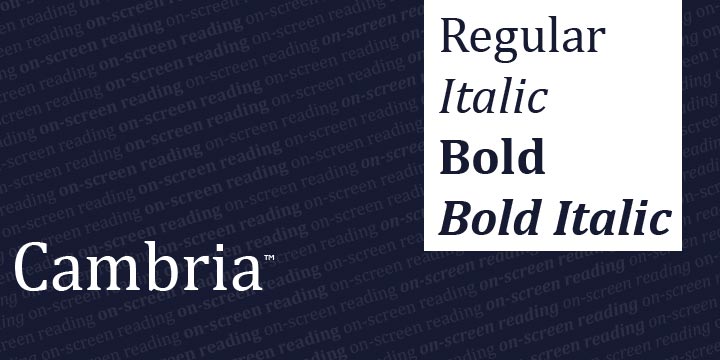
03. Cambria– Best Font for a Resume
Cambria is a serif font that is a part of a suite of typefaces ClearType Font Collection. It has been widely used with the Microsoft Office programs as well. The typefaces: Calibri, Cambria, Candara, Consolas, Constantia, and Corbel were designed to perform on the monitors of a computer. It is described as the ‘New Times New Roman’ that was designed for on-screen reading and applicable for print too as mentioned by the studio that created the font. All thanks to the sturdy letters constructed even at small sizes that make Cambria a good choice for both printed and online resumes.
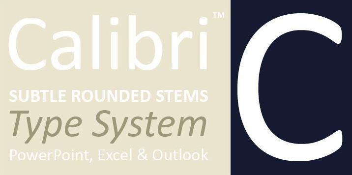
04. Calibri- Best Font to Use for a Resume
Calibri has been a default Microsoft Word font since 2007. The professional resume writer; Donna Svei points out that typing in Calibri at 12 pt. The size will produce around 500 to 750 words, the ideal length of a two-page resume.
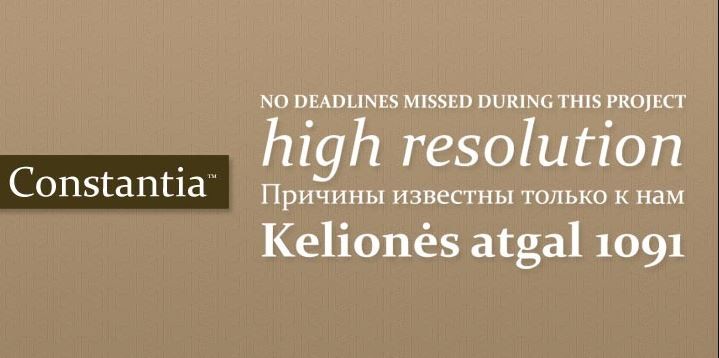
05. Constantia– Best Font for a Resume
Our third and last selection from Microsoft’s ClearType Font Collection, Constantia is a rounder letterform that makes a document look friendly and less stuffy compared to the serif typefaces. The font is also suitable for both on-screen and in printed documents making it useful to distribute your resume in digital and hard copy form.
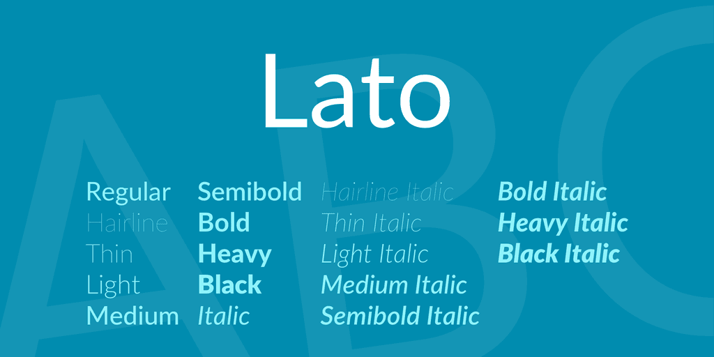
06. Lato- Best Font to Use for a Resume
Lato is originally designed for corporate use and is a sans-serif font created for a neutral body copy with some unique traits at larger sizes. The designer who created the font describes Lato as a ‘serious but friendly’ font, perfect for resumes. It has many varieties ranging through the ‘hairline,’ ‘thin,’ and ‘light’ weights that will be hard to see in small sizes. Lato is available for free to download for both personal and commercial use and Google Fonts.
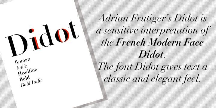
07. Didot– Best Font for a Resume
It is a distinctive serif font that is an upscale look with its Parisian roots. This typeface can give some style to your resume. It is popular within industries like fashion and photography and is delicately displaying clearly at larger sizes saving Didot for headings rather than body copy.
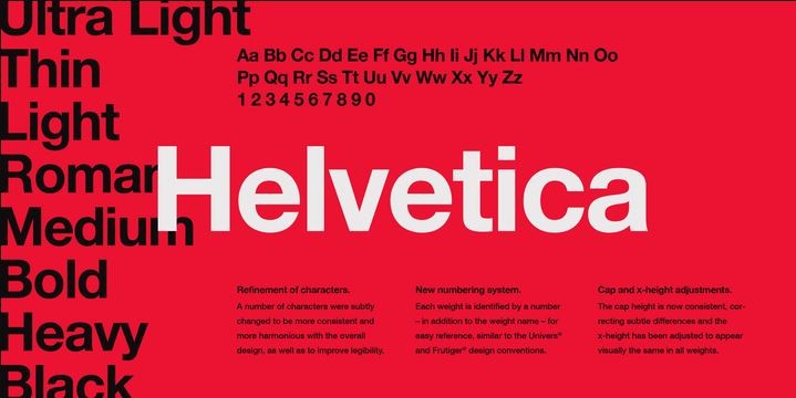
08. Helvetica- Best Font to Use for a Resume
It is a Swiss sans-serif typeface that is considered by typographers and designers as the king of fonts and has its self-titled documentary film. Helvetica is widely used in corporate logos such as BMW, American Airlines, Microsoft, and New York City’s subway signs. This helps give your resume a clean and contemporary look still being professional.
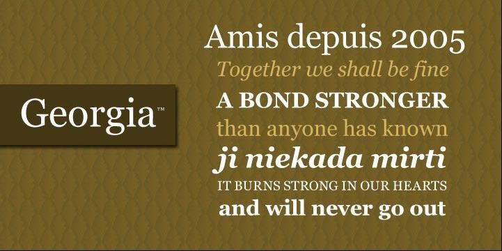
09. Georgia– Best Font for a Resume
It is an alternative to Times New Roman and has letterforms with thicker strokes making it easy to read even at small sizes. It was created specifically for clarity on the computer monitors that look great on any digital document.
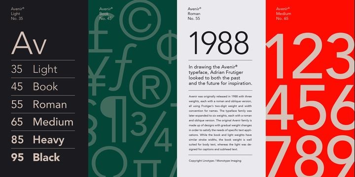
10. Avenir- Best Font to Use for a Resume
Avenir has a clean, crisp appearance that helps your resume with an updated look. The multiple weight it has is used to differentiate the various sections and features in the resume. It is an option released to improve the font’s on-screen display capabilities.
The worst resume fonts
Just like the top 10 best font to use for a resume, here is a flop side instead. The top 20 worst fonts to use on a resume:
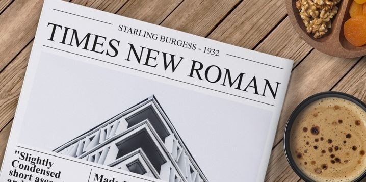
01. Times new roman
Did this surprise you? To make the air clear, there is absolutely nothing wrong with this font, just that it has been used way too much and abused. Since everyone uses it on their resumes it makes it difficult for yours to stand out and it is a hard font to read at very small sizes.
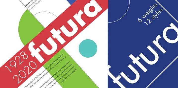
02. Futura
It was designed in the 1920s in Germany and has a more geometric form. It is a clean, attractive font but the overall appearance is stylized and atypical making it a difficult font to read from. With unusually tall lowercase letters and a jarring contrast between the round letter shapes and sharp letters, it leans more to a decorative and interesting display font that is meant to be used sparingly compared to the practical text-heavy documents like resumes.
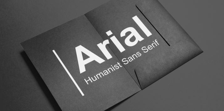
03. Arial
Arial is another font that finds its place in the overused category. Using a font over and over again makes it common and boring and is perceived as a lazy choice. It is an adaptation of Helvetica, a little looser, and irregular in its construction.
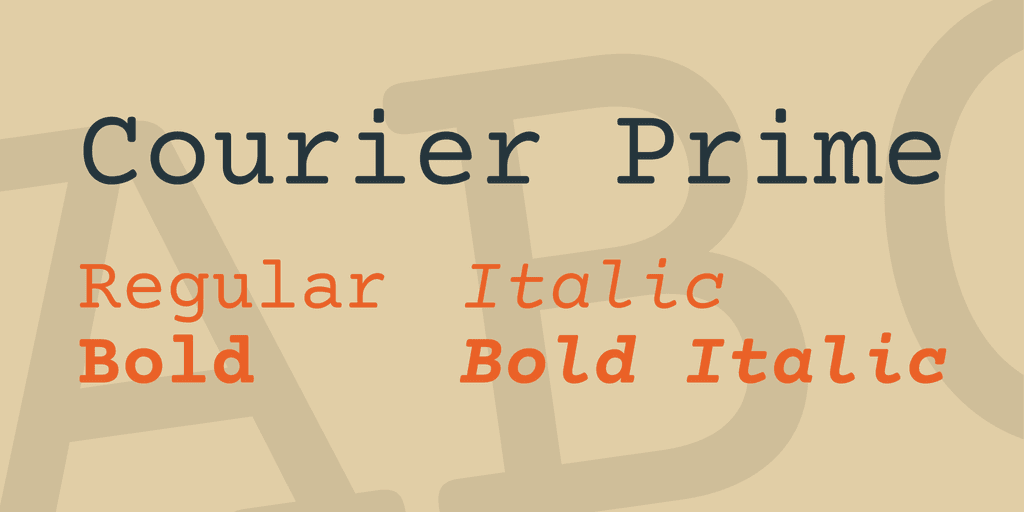
04. Courier
It was designed to replicate the look of a typewriter and then was adapted for the use of an actual electric typewriter. This font makes it look like you typed your resume on a typewriter which you perhaps didn’t and unless you update your resume in 30 some-odd years it wouldn’t be required.
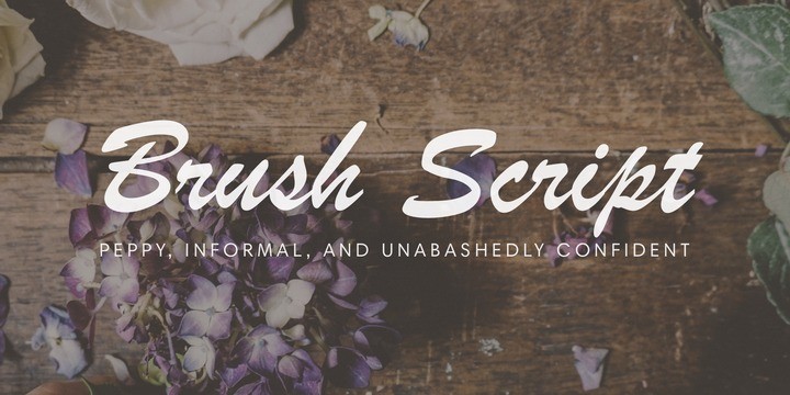
05. Brush script
The font is also clubbed into the overused category and it seemed like a cheap and outdated rather than retro and nostalgic. Although, certain creative industries would offer some leeway in playing with the appearance of the resume but when in doubt it’s always a safe bet to stick to a conservative font instead.
06. Comic sans
Created in 1994 the look of a comic book, Comic Sans is considered the cardinal sin of font choices. This childish-looking font makes it distracting in any serious context. It is a good rule of thumb to always stay away from a font that might come across as fun, flashy, flowery, or funky.
07. Century gothic
It has a sleek modern look and is a little too irregular for resumes. The thin letters of this font’s regular weight can also be hard to read, particularly in small sizes.

08. Papyrus
Papyrus is a cliché font that has become a joke as rightly put forward by Fast Co. Design. The font used to spell the word ‘Egypt’ is Papyrus.
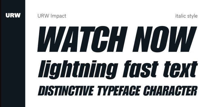
09. Impact
The impact is intended to be used in all caps for headlines. It also includes lowercase letters that people use for body copy where it is almost impossible to read.
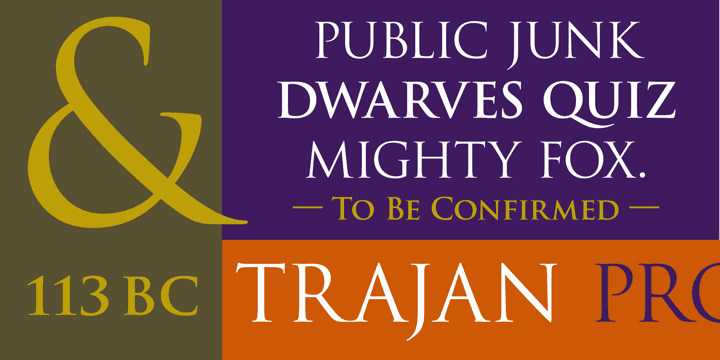
10. Trajan pro
Although Trajan Pro has a dignified important feel, it would be more appropriate to stone than on a typed resume. The font has only capital letters and small caps and no lowercase option that makes it unsuitable for typing out readable sentences making it difficult on a resume too.
To Conclude: The Worst and Best Font For Resume
Fonts are an important aspect when resumes come into the picture which makes it extremely easy to know of the tight fonts. A font size of 10 to 12 pt. depending on the particular font is standard to use and larger sizes are acceptable for headings or subheadings. Remember, the interviewer views the resume on a computer and might have different fonts installed so the typeface automatically replaces with a substitute messing the document’s appearance and formatting.
FAQs: 10 Worst and The Best Fonts To Use On A Resume
1) What does Font mean?
The font is a collection of characters that is similar to the design and includes lowercase and uppercase letters, punctuation marks, numbers, and symbols.
2) What is another word for the font?
The font has many synonyms. Some of which are; lettering, glyph, script, print, etc.
3)What is the oldest font?
Trajan is the world’s oldest typeface. It was the last stamp design of nearly 500 done by van Krimpen.


Features
Explore templates
Alternatives


© 2024 Glorify App - All rights reserved