Discover the essence of Amazon Storefront banners and their pivotal role in captivating potential customers. Learn the optimal size – 3000 pixels wide by 600 pixels tall – for seamless integration and stunning visual impact. Uncover expert tips for crafting compelling banners that reflect your brand identity and drive sales
Posted Nov 9, 2022
•
8 min read

Graphic design, Marketing

Create beautiful marketing graphics at scale.
How To Choose Brand Colors: Choosing The Right Color For Your Brand
What do colors mean?
Colors are everywhere. They play a major role in our lives both in the personal and the professional sense. When it comes to branding, it is important to understand that colors say a lot about your brand personality and message. Colors tap into the emotions of your audience without you having to say a single word.
However, you can easily understand these emotions by using color psychology. This is the study of how each color impacts the minds of humans and what message it sends to them. Let's take a look at what each color symbolizes.
1. Red
Associated with danger, excitement and energy. Is popularly known as the color of love, passion and desire.

2. Pink
Generally associated with romance and femininity. However, various shades of pink can be experimented with to give off different messages. Magenta and hot pink, for example, can be used for a more bold approach.

3. Orange
On the surface, it looks like a color that would be used for freshness and vitality. The underlying meaning, however, portrays creativity and from a business perspective, cost-effectiveness.

4. Yellow
The ever-playful, happy and optimistic color. Works very well in the food industry, often to attract kids and youth.

5. Green
Mostly associated with nature, the environment and eco-friendly ventures, green is also used to depict money and prestige.

6. Blue
Popularly known as the most trustworthy color, blue gives of a sense of calmness, reliability and peace.

7. Purple
Used mostly by brands going for a richer, more elegant look since purple is the color of royalty and majesty.

8. Brown
Comes into play for brands whose products are organic and wholesome. Brown is also associated with being down-to-earth and honest.

9. White
This one is a classic. White typically symbolizes purity, innocence and simplicity. It is also used to give a minimalistic, elegant look to your brand.

10. Black
The timeless classic which never fails to impress. Though widely used to convey a formal and luxurious image, it can also look gothic and sorrowful. If you do choose black as your brand color, you need to be careful that you give out the correct message.

How to choose the right color for your brand?
While the aesthetic appeal is important when it comes to brand colors, it isn't everything. You may like the look of a certain color combination, but if it doesn't resonate with your product and target audience, it's best to keep experimenting. For instance, black is a classic go-to color associated with elegant and mature brands. However, it would be a terrible choice for a children's stationery store.
Here are some points to consider when choosing a color palette for your brand:
1. Identify brand goals and personality
Before you can start on your rebrand strategy, you need to ask yourself some questions:
What are my brand goals?
Who is my target audience?
What message do I want to send my audience?
Citibank, Bank of America, Chase, and Barclay’s – all of these institutions are blue, which is obviously not a coincidence. These banks want to give off a feeling of reliability which is why they decide to go with calmer tones and moods. Imagine if Citibank used the color pink. What impression would it leave on their clients? At the same time, imagine Victoria’s Secret being blue instead of pink. It just doesn't sit right, does it?
This is why you need to understand what your brand offers, who you serve and what your brand personality is. If you don't have a concrete impression of your brand, how can you expect other people to understand it? If you dive into the branding process not knowing what you want, your entire brand will end up confused, messy and muddled.

2. Study your competition
When entering a market that already has a lot of similar, pre-existing products, there is a high chance of your brand being ignored or overshadowed. The main reason to study your competitors is not to imitate them. On the contrary, this helps you decide what you can do to stand out of the crowd.
Choosing unique brand colors while still staying relevant can be quite a challenge. But once it's done, your products will make a statement for sure. For example, if you run a moisturizer company, placing your white product bottle on a shelf full of other similar products will not make sense. Moisturizers usually look similar as they all come in very subtle colored bottles like white, baby pink, or beige. However, let’s say your moisturizer is infused with lavender, a purple moisturizer bottle will surely grab attention!

3. Experiment with several color palettes
When picking up a color that you believe suits your brand, remember that every color has a huge range of shades and hues. In other words, blue is not just blue; it is light blue, navy blue, sky blue, aqua blue, and even grey-blue. This is why an understanding of color hues, shades, tints, tones and codes come is extremely important in the branding process.
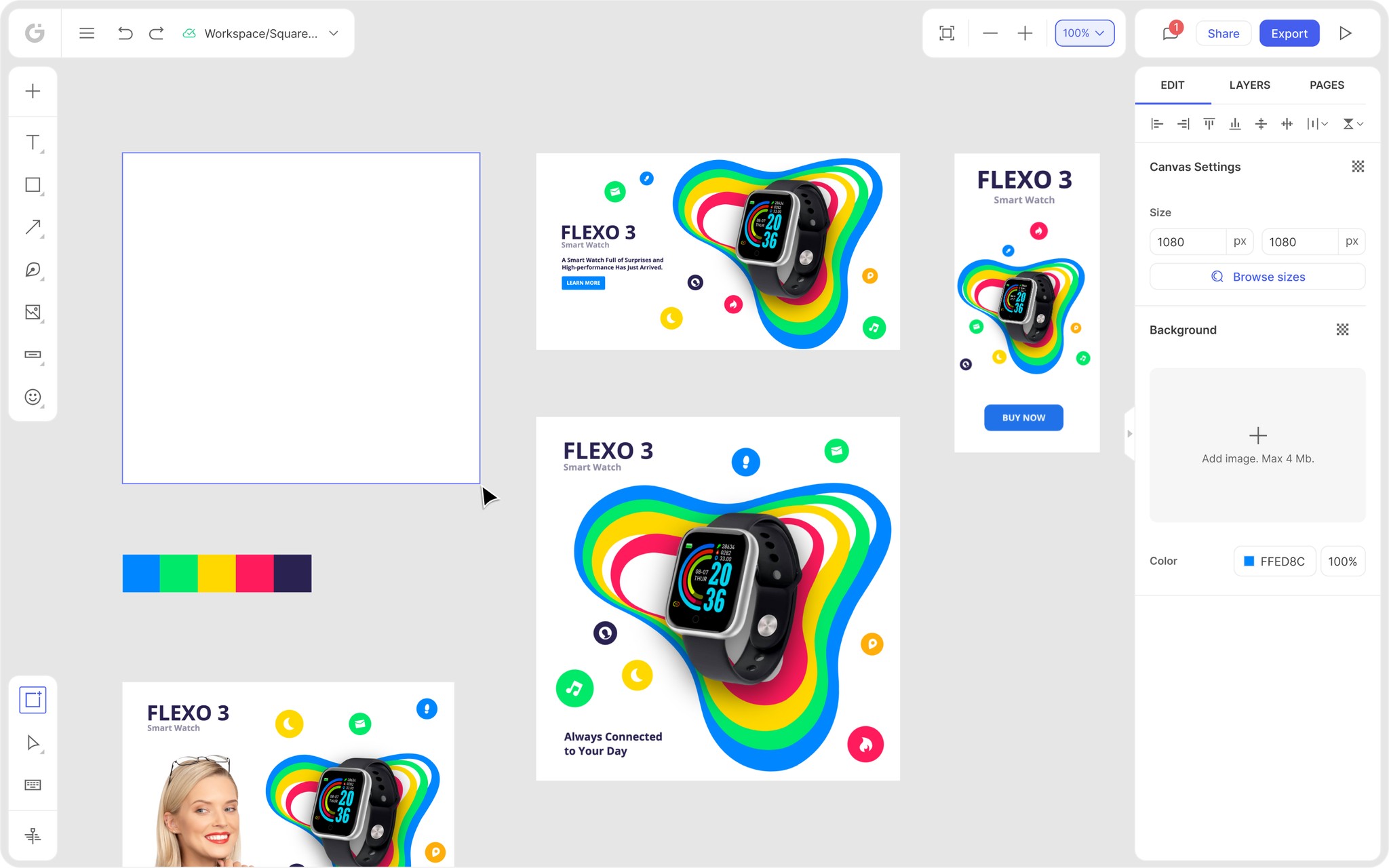
Since brands have multiple colors, putting them all together in one place creates a brand palette. Color palettes help you see all the colors in one place, perhaps on one mood board, so you can analyze your choices and see if that's what you want to work with.
This is where design tools like Glorify come into play. Keep reading to find out how this tool can simplify your branding process.

How can Glorify be used in the branding process?
Creating an entire brand strategy is not easy. There are many elements to work on and a ton of things to keep in mind. However, Glorify can make your life a whole lot easier. Glorify is an easy-to-use design tool that is ideal for both designers and non-designers alike. With simple tools for beginners and advanced tools for professionals, anyone and everyone has the chance to create stunning visuals regardless of prior design experience.

Glorify's Infinite Canvas is the main feature that can help you in this process. You can center all your marketing assets in one place to make your workflow more efficient and organized. To top it all, the Zoom to Content option allows you to easily locate your assets in this infinite space.
You can also experiment with limitless color palettes to find the ideal one that suits your brand. You can simply click the color on the palette and keep clicking to mix and merge colors to find the ideal one.
Glorify' Brand Kits also help you stay organized by keeping the fonts, logo variations, color palettes, icons and other brand assets in in one convenient place. Apart from this, there are many other features that can help you create effective marketing strategies and designs. These features include an instant background remover, a logo maker, thousands of pre-designed templates, template bundles, Smart Shapes, an advanced pen tool, mockups and a whole lot more!
Final thoughts
Although the subtleties matter, remember that there are no strict guidelines when it comes to choosing the right colors for your brand. Green may represent nature, but that never stopped the oil company BP making it their brand color! So don’t hold back when experimenting.

Once your brand colors have been chosen, make sure you stick to them. Being inconsistent with brand colors will give your company an unprofessional vibe that drives customers away. Let your colors appear in all touch-points and interactions since you’ll eventually be associated with them.
Make sure to test out the colors in all formats whilst experimenting. You’ll want your colors to appear on logos, websites, business cards, advertising, stationery, social media platforms, uniforms – you name it. So they should work on both printed and digital marketing and brand assets.
Using a third party design app like Glorify allows you to center all your branding assets in one place. This makes the entire process quick and easy and will leave you with a solid brand in no time. If you're ready to experiment with colors for your brand, get started with Glorify today!
FAQs
1. What are brand colors?
Brand colors make up a palette of around five colors that represent a company. These colors are used in all marketing material and social media content in order to establish brand recognition.
2. What is the best color for branding?
Blue seems to be the best color for branding with 30% of companies using it. Red makes a close second. This doesn't mean blue and red are the best choices for your brand. Despite the popularity, the wide use of these colors has made them quite common. So it's always best to go for a different color palette that makes your company unique.
3. What colors go well together in branding?
Yellow and blue like in IKEA, Walmart, Visa, Pokemon
Orange and black like in Halfords, Amazon, TNT, Harley Davidson
Yellow and red like in McDonalds, Shell, MasterCard, Lego
4. What colors should not be used in branding?
There is no rule that states certain colors should not be used in branding. The suitability of the chosen colors depend entirely on your brand, product and target audience. However, avoid using weak colors like grey for bold products. Go for brighter colors that make a statement. Similarly, avoid going too bold for mature products.
Features
Explore templates
Alternatives
© 2024 Glorify App - All rights reserved


