Discover the essence of Amazon Storefront banners and their pivotal role in captivating potential customers. Learn the optimal size – 3000 pixels wide by 600 pixels tall – for seamless integration and stunning visual impact. Uncover expert tips for crafting compelling banners that reflect your brand identity and drive sales
Posted Nov 9, 2022
•
8 min read

Design, Graphic design

Create beautiful marketing graphics at scale.
Minimalist Logos: 3 Tips to Create a Minimalist and Simple Logo
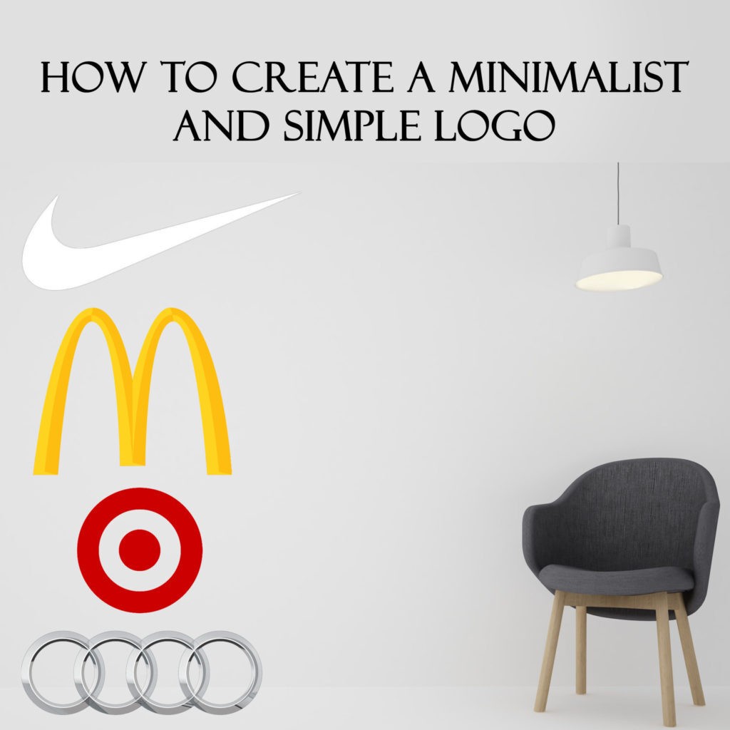
A lot of major brands also have taken the minimal route for their logo design purpose. Mc Donalds, Nike, Target, and Audi being some iconic examples of brands that use minimalist logos..
So what really is minimalism?
On running a quick Google search, one can find minimalism define don Wikipedia as “a style that only uses essential elements for maximum impact.” Oftentimes, people tend to confuse minimalism with simplicity, however, on a similar search, you will find simplicity defined as “state or quality of being simple”
Hence, minimalism and simplicity, though related, cannot be used as synonyms or interchangeably. Minimalism is the idea of losing excessive elements and become simple as a whole – while not losing out on the impact that can be possibly created.
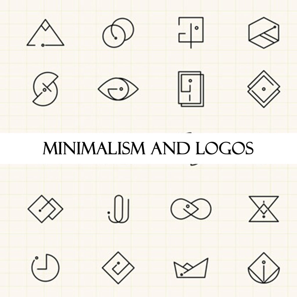
Minimalism and Logos
Logos, needless to say, are a very essential and defining part of a brand’s identity. They drive the audience to recognize your products just by looking at that one shape of your logo. Logos of a brand do not only need to be well-thought of, but also relevant. Brands have now, over time, even changed their logos from what they once looked like as they understood the need of looking simpler to grab maximum attention. For example, look at Ikea and Adidas over the years – their logos have changed to minimalistic logos and how!
Apart from the fact that brands recognized the need to stay in tune with the latest market design and needs, the new logos or changed logos had to be introduced by brands because of the change in mediums. Earlier, logos would only appear on the product, advertisements in papers or on TV, and probably on hoardings. However, with the advent of the internet, brands recognized the need to make logos that look good on the web and not only physical media. This also meant creating logos that look good on small screens. A sophisticated, spot-on logo would ideally be something that is engaging in terms of the visuals, and also in a way is able to communicate what the brand could stand for.
How to make a minimalistic logo?
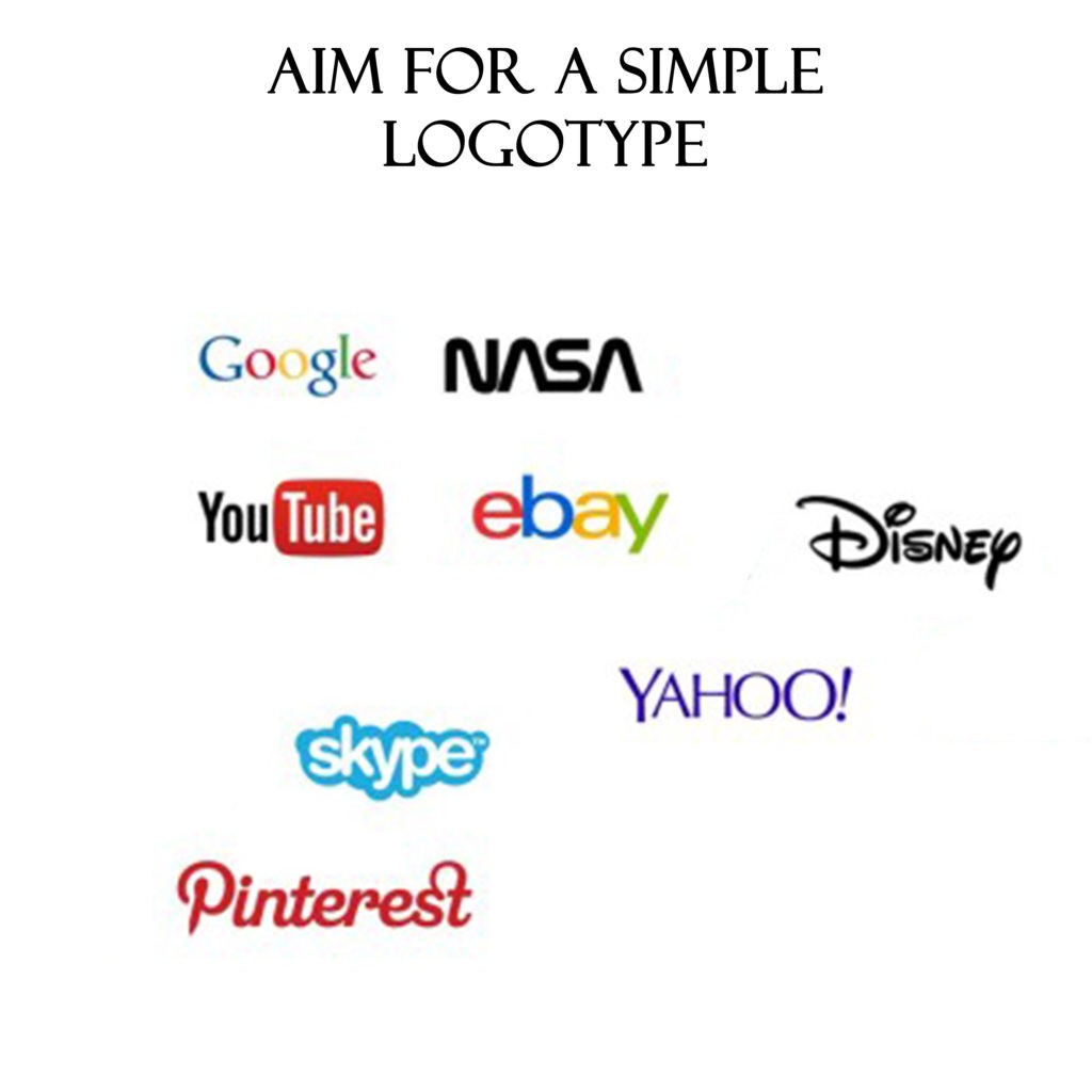
1. For the obvious: Aim for a simple logotype
For a better understanding of this, let us understand the difference between a logomark and a logotype. A logotype is essentially a logo that is centered around the company name or initials, for example, LV of Louis Vitton. A logomark, on the other hand, is a logo that is centered around a symbolic image, for example, the twitter bird. And a logo, is a generalized term, that refers to all marks that represent a brand- the logo could be a logotype as well as a logomark. A logotype is considered to be the easiest and most impactful option while picking a logo for your company as it features your company in the very logo. If you do really intend to go with a logotype as your minimalist logo design, it is important to not ignore the importance of choosing a relevant font.
2. Use Lines
Lines are the core of any design. You might be led to believe that lines will form a boring design but do not be mistaken! With just a few lines, you really can make an emblem for your company that does not only look edgy but actually grabs all attention. The key here is to really look through your concept and aim for simplicity yet not be ordinary. For example, Soundcloud, IBM, Cisco.

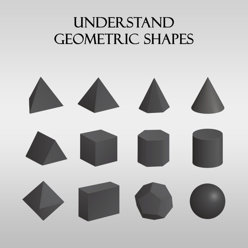
3. Understand Geometric Shapes
Geometry and symmetry are something that cannot be ignored when it comes to any design, let alone minimalist logos. But again, just like colors, it needs to be understood that each geometrical shape has a meaning attached to it. Try and understand the meaning, probably even take help from a seasoned designer to ensure you do not end up conveying something subconsciously that your brand does not even stand for in the first place.
Circle Logo
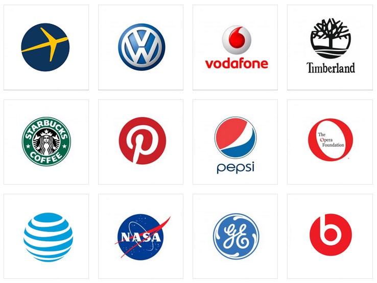
An all-time season logo shape is, not definitely circle. Circle works great for brands because an ellipsis and a circle symbolize unity, love, commitment, and harmony. A circle also, in fact, symbolizes movement and transformation by virtue of its resemblance with a wheel. Even the Olympics symbol was created with this logic in mind. The 5 circles in the Olympic logo stand for the unity between 5 continents that participate in the event.
Square Logo
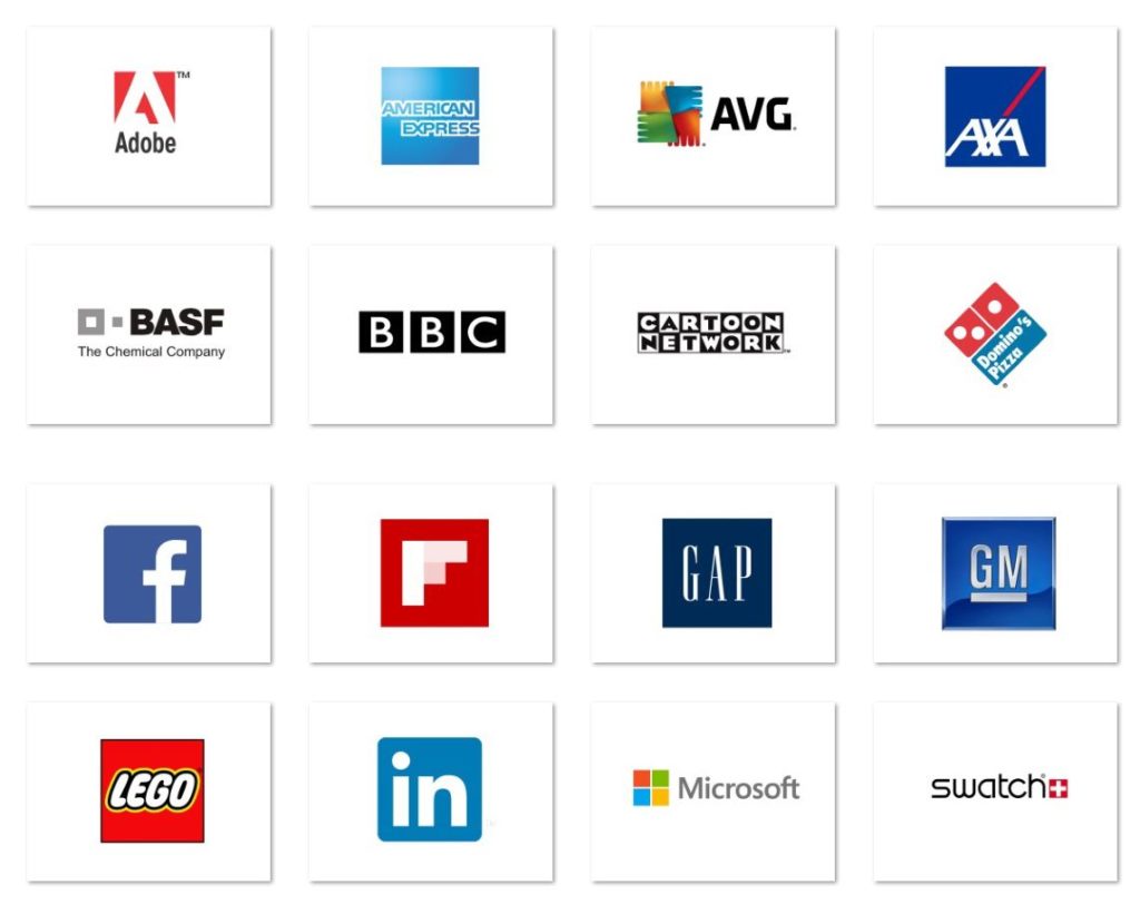
Square logo? Instagram! Square is only second to a circle when it comes to popular shapes that are used for a logo worldwide. A square works well because it stands for balance, reliability, and professionalism in the designer world. It is also a very common choice or designer; however, if you choose square as your logo shape, ensure to pop it up with some colors as Instagram did. A boring and unattractive logo is only as good as no logo.
Triangle Logo
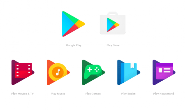
Less popular in general and perhaps the least favorite choice of designers, a triangle is rather underutilized in the design world. It works as a powerful visual tool as it gives out the impact of a huge inspirational force behind it. Adidas did not choose a triangle just randomly after all! Even if you look at a shape that is generally used to define power, it is a triangle, Hierarchy, change, improvement – they are all depicted with a triangle. A triangular minimalist logo, however, can be a bad choice for a brand that wants to send out an image of safety and comfort.
Concluding Thoughts-
While coming down to a relevant creative for your logo in itself can take some time, infusing minimalism with logo can get challenging and we do understand that. However, the power of a logo cannot be misjudged. It is the face of your brand and a logo is what has the potential to set an impression of your brand even before a consumer learns what your brand or products are about.
Logos interact with your customers even before you or your products do.
Logo designing, when you really get to it, might have you realize that it is not as easy as it seems and it is also okay at this point to take a step back and understand it is okay to take a trial-and-error route. You could always also learn more by reading up about the logo journeys of brands that inspire you as a business owner. If you do happen to find yourself stuck in the whole process of generating a minimalist logo and your creative juices do not seem to flow in the right direction, let Glorify help you with your logo!
Our logo maker tool frees you the hassle and cost of hiring a logo designer. More than being expensive, a logo designer might not always deliver what you want as there could exist a gap in the communication of ideas. You will never have to compromise to arrive at the right logo ever again with our DIY logo-maker tool! Pick from a wide selection of hand-picked professional logo templates and give your brand the logo no one will ever forget. Our logo maker generates hundreds of designs just in a few clicks!
Features
Explore templates
Alternatives
© 2024 Glorify App - All rights reserved


