We’re thrilled to announce that Glorify is officially partnering with Contra! This collaboration opens up exciting opportunities for designers, marketers, and creators in the Glorify community.
13 Best Banner Examples To Get You Inspired Instantly

What Are The Benefits Of Using Banners?
Banners are intended to entice you to click on them and visit the advertiser's site.
But, the question arises, do you click on the banners, or do they simply annoy you?
If banners are visually attractive, cheer you up, or make you smile, you will click on them. People are tired of boring ads that are vague or don't apply to them.
Well, utilizing a banner for your business has many benefits.
They are the most traditional type of advertising and can leave a lasting impression on customers.
Banner advertising is the most popular and cost-effective method for promoting new goods or services and establishing your brand.
A well-designed banner can help you to:
Boost visibility and sales,
Market at a reasonable price,
Target specific customers,
Track how effective your campaign is.
Using appropriate sizes is one of the most crucial factors to consider when designing banners for display advertising.
On the other hand, the performance of adverts is significantly impacted by the banner size, and making the appropriate decision can improve your marketing outcomes.

Since Google Ads come in various banner ad sizes, use standard banner ad sizes to get the intended result.
What Makes Banners Successful?
These 4 golden standards will create click-worthy ads to make your banner stand out:
1. Your banner should be easy to comprehend.
An average user needs to understand your message within seconds.
2. Use relevant images.
Incorporate high-quality images into your banner ad that catch attention.
3. Don't put too much text.
Keep your message short and simple.
4. Use CTA.
A strong but clear Call-To-Action will tell your customers what to do next.
When someone clicks on your advertisement, words like "Shop", "Buy," or "Find out how" make it clear where they're headed.
Let's move to the best banner examples and see why they work.
13 Best Banner Examples To Get You Inspired
1. Dreamworks

The quirky, vivid pictures instantly grab your attention.
Bold colors and a creative font go well together.
Whether you click on the ad or not, it still raises brand awareness.
Dreamworks’ banner is an excellent example of how this banner ad targets the audience.
It is funny, creative, and, if nothing, it can put a smile on your face.
2. Glassdoor

CTA is straightforward and conveys your message clearly.
The text is short and applies to the target audience since Glassdoor is oriented to job reviews.
The rich green color matches the company's chosen palette.
This video shows a woman struggling to find the ideal career and browsing through job applications. It draws interest, and it displays a real-life situation.
However, the straightforward advice to "choose a job that loves you back" appeals to worn-out workers.
3. It Cosmetics

This banner features large, eye-catching product images and text.
A compelling product name entices you to learn more about it.
The colors are soft and pastel, not overpowering the product image.
With a massive, vibrant product image, an alluring product name, big font, and an impossible-to-resist promise, It Cosmetics invites you to click on the ad and learn more about this product.
4. Bulldog

This banner ad uses humor and quirkiness to convey the message.
The contrast between white and green is appealing.
The 'Shop now' button is clearly visible and tells customers what to do next.
All the relevant information is listed on the banner without making it busy.
It is fun, and with its humorous approach, it stands out.
5. American Eagle

This is an example of a simple and clean banner ad.
It doesn't contain any text except for the CTA. The focus is on apparel.
The colors are soft and muted. The tones of clothes and scenery are well-blended, making the whole scene cohesive.
These banners are well suited for promoting new clothing collections, specifically at the beginning of a new season. It mainly targets young, athletic people looking for leisure wear.
6. Nike

This banner is a great example of how to feature a single product.
Due to their simplicity, product images are a good method to encourage customers to click on your ad banner. If potential customers see a product they like, they will be interested in clicking on it and learning more about it.
These types of banners also remind customers of a purchase they consider to make or haven't finished yet, much like an abandoned cart email.
7. Zara

Zara uses color theory wisely. It is known that bright and bold colors, especially red, catch the customers' attention effectively.
Strategically placed text simultaneously focuses on the banner's message while showcasing the selected products.
The 'Plan your visit' button suggests to shoppers what to do next.
In this banner, Zara illustrates how effective color utilization is.
The selection of various red products mixed together is appropriate for promoting a particular store.
However, if vivid colors don't fit the aesthetics or your brand's vision, it is much wiser not to use them.
8. Google

The images you use should be relevant to your target audience. A generic image isn't appealing as a real person that adds that personal touch to your ad.
Customers can easily relate to your ads by giving them a human touch.
Try to convey your message by simulating real-life situations. This way, you can avoid your banner ads looking overly polished and unrealistic. You don't want to make banners that will be annoying or overlooked, do you?
9. Patek Philippe

This unique solution for a banner features plain text without any images.
The focus is on the benefits of having this luxury product, which is so valuable that it will be passed down to the next generation.
Simple, minimalistic design enhances the written text.
Do you want to communicate anything significant to your audience? Use the power of text to highlight the perks of your service or products.
10. Brita

In this example, Brita emphasizes the text with bold font.
The language is concise and sharp and effectively conveys the point.
The background is in the shade of water with contrasting purple.
This makes a visually attractive choice, which makes this banner stand out.
Communicating promotional messages successfully with limited space and without cluttering the design might be challenging.
Still, keep in mind the average attention span. So, keep it short and simple.
11. Samsung

This clean and smart design is perfect for busy websites.
The ad's straightforwardness and simplicity fit perfectly with Samsung's overall branding.
This banner ad aims to raise brand awareness and build customer loyalty.
12. Disney +

This Disney banner ad has a unique tagline ("Exclusive Original series") and prompts immediate action ("Start your free trial") with its call-to-action button.
This is an excellent example of how you are not required to promote a deal or special offer. Just emphasizing your brand's unique selling proposition might motivate your customers to click on the banner.
When creating a banner ad, you should focus on significant, meaningful, and beneficial topics for your potential clients.
13. Gucci

Gucci, for their Jewelry collection, uses a simple and clean layout.
The model is at the center of attention, with a subtle CTA which leads to their website.
Gucci, among many other big brands, often collaborates with celebrities.
If you are a small business owner, think about partnering with a local influencer or a blogger and promoting it using a banner like this.
Common Mistakes You Should Avoid
As you can see from the best banner examples listed above, to create a victorious banner, you should:
Be compelling.
Be concise.
Be clear.
But we all know that the creative process can be a mess, so here is a quick reminder of the things to avoid:
1. Do not overpower your website with lots of banners. It can be distracting and result in poor user experience and customers leaving the website.
2. Do not use generic banners. It is important to know your average buyer and tailor your ad to their needs.
3. Do not use blurry or low-resolution images. Make sure your picture is big enough to be clearly viewed.
4. Refrain from using images merely for their own sake.Use an image only if it is relevant to the subject matter of your banner ad.
5. You are not sticking to your brand's identity.Your brand identity can be established by using a clear heading and branding your banner ad with your logo. People won't know who is genuinely advertising something if you don't have a logo or brand name to identify you.
Conclusion
Banner ads are an excellent, cost-effective tool that you can use to boost sales and improve site traffic. They can be used to promote almost anything – products, services, campaigns, and more.
This article suggested some of the best banner examples and why they work.
If you follow these recommendations, they will surely inspire you to give your customers a memorable experience that results in conversions.
But keep in mind that banner ads should be eye-catching and exciting.
Try out several fonts, colors, and designs until you find the one that best suits your brand.
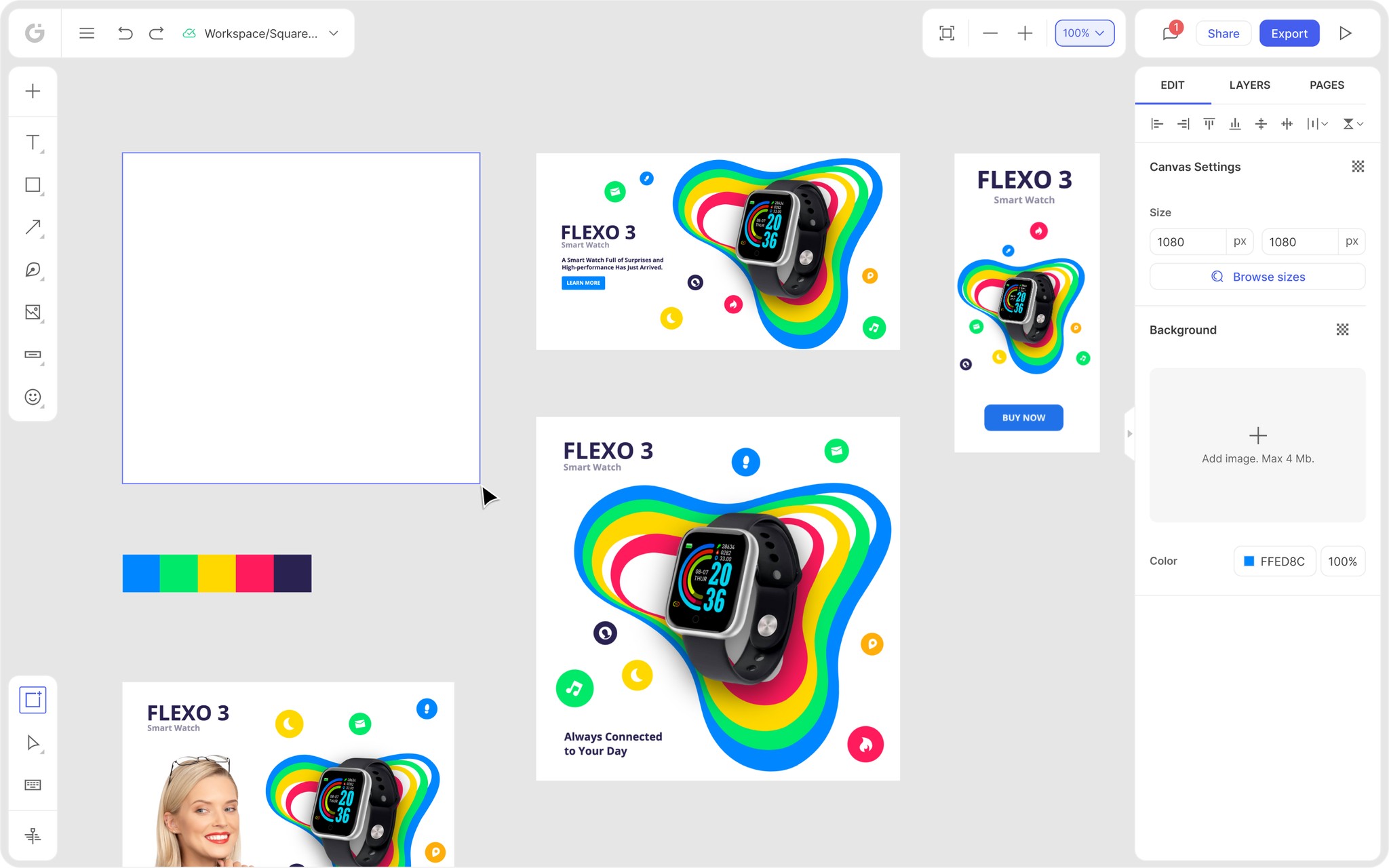
To make creating a banner easier for you, we suggest you use Glorify, a cloud-based online tool.
Glorify allows you to create stunning banners suitable for Linkedin, Etsy, social media, and all across the web.
Follow these simple steps:
1. After logging in, select HD banners from the main page.

Every template can be filtered by Niche or Theme.

2. After selecting the desired template, it will open in a bundle.

3. Every element of the image is fully customizable. By selecting any image segment, an editor will open on the right.

4. Use the Brand it feature to apply your color palette, logo, or custom font.

5. Easily resize your design without compromising on the quality. From the drop menu, select one of the offered templates.

6. When you are satisfied with the end result, save it, invite your team members to comment, and share it to an email, social media, or website.

So, if you want to start creating stunning banners, you can do it hassle-free with Glorify.
Sign up for free, and let the creative juices flow!
Features
Alternatives
© 2019-2024 Glorify App - All rights reserved.


