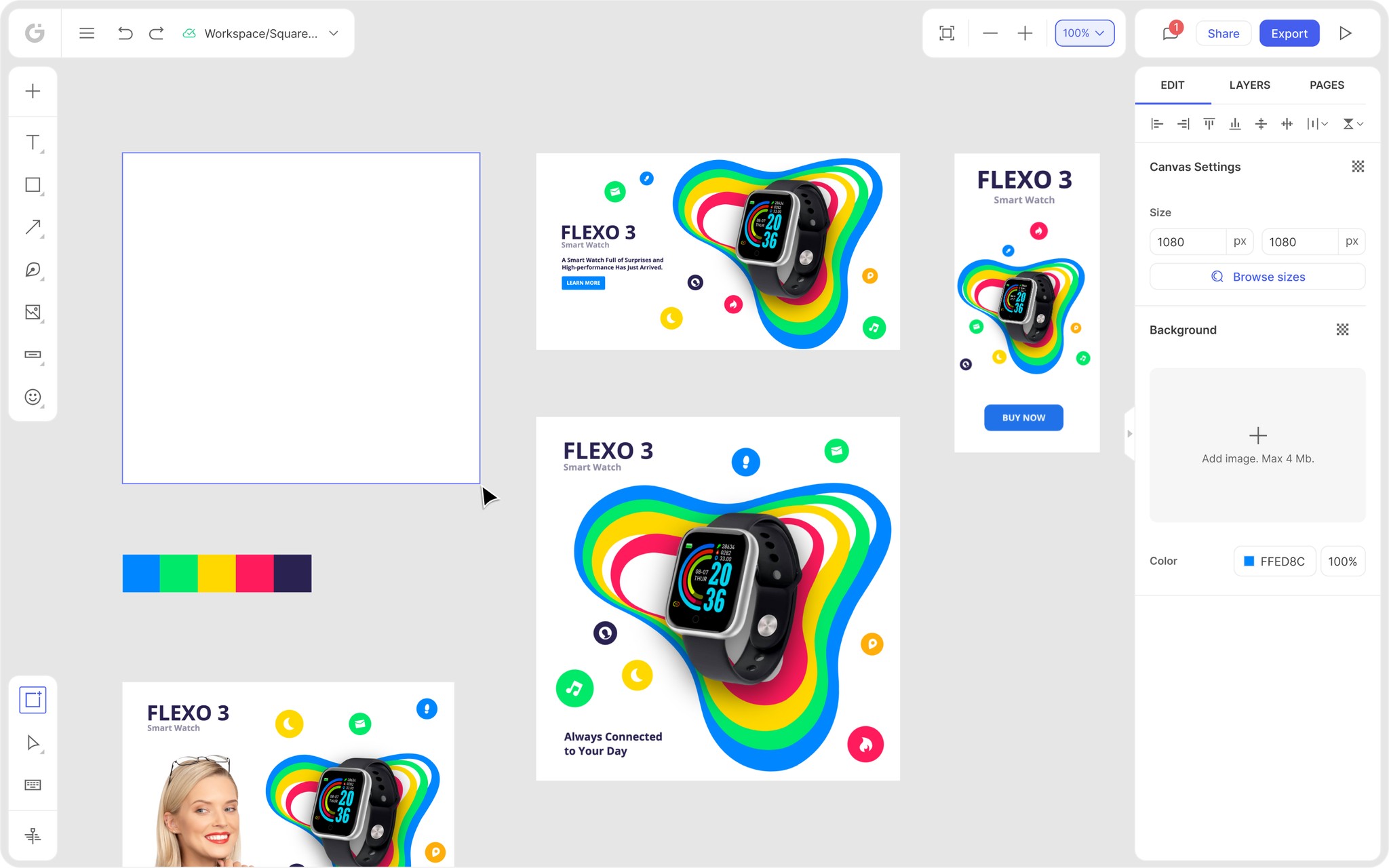
We’re thrilled to announce that Glorify is officially partnering with Contra! This collaboration opens up exciting opportunities for designers, marketers, and creators in the Glorify community.
Best Fonts for Facebook ad creatives [2023 Marketing Guide for Ecommerce]

What are Ad Creatives and Why are they so important?
So, what is Ad Creative? It is an ad with a target of capturing the interest and attention of the target audience.
It uses visuals (text, image, video) to lead the viewer into the action described by the CTA button.
When you try to connect to your audience, using visuals is important because it can make your message come through stronger and bolder.
If your ad is interesting, engaging, and fun, it is more likely that someone will click on it.
That leads us to conversion – it is when someone interacts with your ad, for example, views a video or reads a text ad, and then follows to take some action defined through your CTA – visiting the website, making a purchase, etc.
The goal of every ad is to increase the conversion rate.
And choosing the right font ensures that a reader's focus is on the content, making your conversion rate go up!
What types of Ads can you create?
Facebook offers 3 types of ads:
Image ads
Video ads,
Carousels
1. Image ad is the simplest, consisting of one image and CTA.

This ad is straightforward. As the CTA suggests, you should buy these products if you have dry hair.
2. Video ads
Facebook video ads get 10 to 30 % more views than other ad formats. This is because it combines movement with sound, grabbing the attention of a viewer and leading to better engagement.

In this ad, you can see a promotional video for a perfume with a simple CTA.
3. Carousels
Carousels or a slide show allow you to put several images in one post.

It is a smart way of showing your product from different angles, like in this Nike ad.
Whatever type of ad you choose to create, each one should have
Media – image or video
Text – heading or body text
CTA
The Call To Action should be simple, like Shop now or Learn more, depending on your campaign goal.
Choosing a perfect image for your ad is not a job done. Text, but also the text's font, is also significant.
Let’s see why in the chapter below.
Choosing the best font for Facebook Ad Creative
Many elements form a successful ad, and one that can elevate good content to outstanding is the right font. A well-chosen font will represent your brand.
And what’s more, it can increase conversion.
Now you’re wondering, how’s that possible? How can a specific style of letters affect sales?
Well, it’s science!
Humans are visual beings. Of all of the information our brain processes, 80 % are images. It takes us 13 ms to process an image!
Visuals generate different emotions in us, and emotions create deep connections.These emotions come subconsciously, originating from the central nervous system.
Men and women react differently to colors – females are usually attracted to lighter and brighter colors, while males are the opposite.
Now you know some facts, so let’s choose the best font to increase conversions!
1. Think about how you want to portray your business. For example, as nostalgic, futuristic, elegant, humorous, classic…and then choose font or combination of fonts accordingly.
The other aspect is to know your audience. Who are you advertising to?
Let's say you have a bakery, and your average customer is female, family-oriented, and in her 30s.
You already know that you should choose a creative, friendly, clear font.
2. Research showed that serif fonts performed poorly throughout the Facebook ads test.
Serif font, one with 'hands' and 'feet,' is more suitable for books, magazines, and e-readers. On the other hand, Sans-serif fonts are clear and made for devices like mobile phones, computers, etc., which makes them easier to read.
Maybe because we're used to seeing and using sans-serif fonts throughout the Internet, like Google and Facebook, our brain is set to recognize it as more convenient.
3. When choosing a font, the key is simplicity. Don't use more than three different fonts; keep the copy readable. Over-creative copy may drive some attention, but most viewers would skip it. You are limited to a few seconds to catch a potential customer's interest and have them interested in what you sell before they move on to the next ad.
4. Font color and font size – Readability and legibility are the most important when choosing a font. You want customers to be able to read the text in a few seconds, so don’t put too much text. One or two sentences are enough.
5. Font weight – represents the thickness of the letters. They are — thin (100), normal (400), bold (700), and heavy (900).
6. Line spacing – is the amount of space between the baselines of each line of text. Correct spacing ensures legibility – how easy it is to read the text. Fixing spacing and freeing up white space can increase conversions.
7. Line width – find to the perfect balance between lines being too wide – reader will loose its focus or too narrow – it messes up with the reader’s rhythm.
Here are some well-known and new suggestions to try out for making ad creatives:
Helvetica
Helvetica has been one of the most popular fonts since the 1950s. It is free of emotions and ornaments, perfect for presenting information.
This font is widely used for corporate logos, including Target, American Airlines, Lufthansa, The North Face, Jeep, Motorola, BMW, Panasonic, LG, Microsoft, and many others.

Famous brands using different versions of Helvetica
Interestingly, the U.S. government uses this font on federal tax forms.
36 typefaces in the Helvetica font family can be used together, including the 2019 version- Helvetica Now.
This font is easily readable from a distance and can also be used for designing
logo designs, book covers, social media posts, PowerPoint presentations, advertising and promotions, video editing, menus, branding projects, blog theme designs, product packaging, and so much more.

Part of the 1970s Coca-Cola campaign that used Helvetica
Roboto
Roboto is a font designed by Google in 2011 as a system font for the Android operating system.
It has a condensed look and is legible since it was created for a mobile system. This font is used over social media, especially Instagram.
It offers a variety of weights that read easily at all sizes; it is suitable both for headers and body texts.
It goes well with other fonts like Archivio, Lora, Rokkit, Nunito, Raleway, and Space Mono.

Example of a Facebook ad using Roboto and Roboto Slab made with Glorify.

Example of a Facebook ad creative– Roboto bold, Roboto regular, and Assistant extra regular made with Glorify.
Open Sans
Open Sans is another typeface created for use in print, on the web, and on mobile interfaces.
It is open, neutral, and friendly, according to Google, who created it for their browser Chrome.
Many contemporary brands like Google and IKEA are using it for their branding.
It is used in web advertising and print, such as ad visuals and product descriptions.

Example of a Facebook ad using Open Sans Light +Julius Sans One fonts in Glorify
It pairs well with Montserrat, Bitter, Source Sans Pro, and Domine.
Hernandes Bros
This elegant font has beautiful and harmonious contrasts. Hernandez Bros contains 8 styles, from extra light to black. It was presented in 2021 but has a nostalgic feel to it.
It is suitable for titles, brands, and editorial designs.

Example of Hernandes Bros font , extralight and medium
Merriwether
This font was designed for reading on screens, computers, and smartphones. It has a modern shape but a traditional feel. Since it was created for a digital purpose, it is great for blogs, quotes, and poetry.
The Merriweather set contains light, normal, bold, and ultra-bold styles with matching italics.

This restaurant uses Merriweather font in bold and light

Facebook ad example using Merriweather + lato bold fonts in Glorify.
Montserrat
Montserrat is a functional and contemporary font influenced by the old neighborhoods of Buenos Aires, old posters, and street signs. It can be used for publishing, corporate, advertising, mobile, and games.
It is simple and clean looking. The font has nine styles, from thin to black, including italic.

Facebook Ad example using Montserrat font. Made with Glorify.
This font goes well with Roboto, Loro, Open Sans, etc.
Lato
Another sans-serif typeface, created in 2010. It was created by a Polish designer who named it Lato or Summer. This font is very interesting and has unique curves.
It comes in 10 different styles, from thin to ultra -- bold.
It goes well with Montserrat, Roboto, Open Sans, Playfair Display, Proxima Nova, Vollkorn, Ubuntu, Bebas, Georgia and Roboto Slab.
This font is suitable for body content in magazines, product descriptions and ads.
It is one of the most popular fonts on Google Fonts,and it is used on more than 9.6 million websites.

Example of a Facebook ad using Lato Bold. Made with Glorify
What’s trending?
Like any other industry, typography and design also face trends. What was in fashion last year may not be in the next.
If you are not very adventurous or prefer to play it safe – stick to the classical, but with a twist – Helvetica New.
But, if you want to think outside the box, here are some 2023 font trends:
Original handwriting – This year, maybe more than ever, we need a human connection. Handwritten fonts are emotional, raw, and exciting. They are also social media friendly.
These fonts are perfect for small businesses, handcrafters, artists, and artisans.

This font goes perfectly with the summery, carefree vibe of the campaign
Retro vibes
Every few years, we repurpose style from one of the past decades; now, it's the 70s turn!
Bold, curvy, and thick letters are fun and exciting as the era they represent.

This font is happy and cheerful, perfect for summer! Made in Glorify.
Conclusion
Choosing an adequate font is the last piece in completing the Facebook ad creative puzzle.
When you find a font or combination of fonts you like, stick to them.
The font is also a recognizable and valuable part of the brand and should be carefully selected.
That being said, Glorify can help you with that.
Follow these easy steps:
1. Choose Facebook ad among Templates

2. Type in the keyword to refine your search, for example – Beauty

3. Filter by Niche and Theme Choose among many categories, for example – Beauty and personal care and Retro

4. Click on any Text box to fully customize your ad.

Glorify offers more than 130 fonts selected to offer the best solutions to your needs.
A variety of templates save time and provide carefully selected images, fonts, and tools to customize every part of your design.
Sign up for free and choose among many fonts available to create visually stunning ads!

Features
Alternatives
© 2019-2024 Glorify App - All rights reserved.


