
We’re thrilled to announce that Glorify is officially partnering with Contra! This collaboration opens up exciting opportunities for designers, marketers, and creators in the Glorify community.
Posted Nov 9, 2022
•
6 min read

Entertainment

Create beautiful marketing graphics at scale.
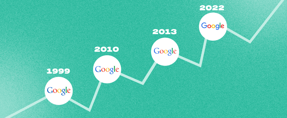
Google Logo History: Why did Google change its logo for the first time in 17 years?

Let’s find out that and more!
What really is so ‘new’ about Google’s new logo?
Unlike Google’s previous logo which was in a Serif font, Google’s new logo was created in a Sans Serif font. The iconic coloring of green, red, yellow, blue was retained, however, the coloring was softened in the new logo. The logo, also, displayed a striking similarity with Alphabet typeface, perhaps to demonstrate the tie between Alphabet and Google.
Other obvious, noticeable, and interesting change was the accessorized, animated dots of red, blue, yellow, and green. The dots swell like a wave, mimic sound equalizer visuals, and, you never know, might as well take more forms and visuals over time. In addition, Google also took this opportunity to bring in version changes to the logo. This made the logo’s display better and clever on smaller screens and devices with lower bandwidth connections.
DIGGING DEEPER INTO GOOGLE LOGO HISTORY: WHY DID GOOGLE CREATE A NEW LOGO?
Google, which launched only as a search engine at first, found itself coming a long way. The company displayed an interest in car design, eyewear devices, global mapping, net neutrality, advertising sales, and even went on to buy YouTube. Google’s tie-up with Alphabet was looking at a movie that was directed to narrow Google’s scope to Google, Nest Labs, Calico, and other businesses including Google X, Google Capital, and Google Ventures.
So, basically, the change was not because the old logo was too boring to look at, but because logos serve a brand as an icon. Icons, in the long run, drive brand recognition and they signal who we are as a brand community. According to Google’s own blog post about logo change, “The new logo was created with Google’s best traits in mind – simple, uncluttered, colorful, and friendly.”
The biggest visible change in the cosmetics of the logo was Google’s switch from Serif to Sans Serif font – a very first in Google’s logo history. Sans Serif, in the world of design, is the font that is associated with decluttering simplicity. This was Google’s way of indicating that Google is no longer just a search engine. They wanted the users to look at them as a cleaner, more modern brand that also serves as your guide to thinking, learning, sharing, and finding your own path.
What was the audience take on Google’s new logo?
The new logo by Google was rather reacted to with some salt by the audience. In one of the most opinionated posts, Sarah Larson from The New Yorker defended the old logo’s classic serif typeface. According to her, the new logo “evokes children’s refrigerator magnets, McDonald’s French fries, [and] Comic Sans.”
The new logo stirred in a lot of other reactions from people, famous and otherwise, across the globe. But again, for a company as huge as Google, even the smallest of change would evoke reactions and curiosity. Logo updates really matter in today’s world and no matter what you think, logos do mark milestones for organizations in the long run. We are all testament to the fact today in 2021, the logo, after all, has been widely now accepted and it did sink in!
Final Thoughts-
Google, as a massive brand, is well aware of what branding really means. They know that branding is about creating a community, about creating a culture inside the company that eventually also reflects on the outside. Icons are a huge part of a brand’s narrative, including the brand’s corporate legacy and they really do drive brands as a whole, perhaps the reason why a giant like Google changes its logo for the first time in google logo history.
For you and your e-commerce to become a brand like that, you do not have a lineage like Google’s logo history. Logos are the face of a brand and you really should do your absolute best to ensure it sets you apart. With Glorify, the job only becomes easier. You can browse through our huge catalog of templates and make a logo for your e-commerce business in under minutes! Glorify is a specialty platform that focuses only on designs for e-commerce and we are your one-stop solution to all your Social Media design needs. Make a logo for your e-commerce brand in a matter of clicks with our logo maker tool!
Google started in garage space; and you never know, even your small brand or e-commerce business could become as huge (or even more) as Google one fine day- just like that. In the meantime, you need to make sure you pick your logos that are worth it!


Features
Alternatives


© 2019-2024 Glorify App - All rights reserved.