


We’re thrilled to announce that Glorify is officially partnering with Contra! This collaboration opens up exciting opportunities for designers, marketers, and creators in the Glorify community.
Posted Apr 13, 2023
•

Glorify Team
Design
Different Types of Infographics: A Comprehensive Guide
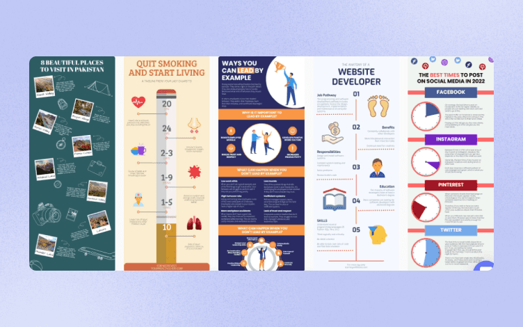
Types of infographics
Discover the top 7 types of infographics that will elevate your brand and message. Using this marketing method is a great opportunity to not only increase engagement across social platforms but is more cost-effective.
The varying types of infographics can help you personalize your message to specific demographics or audiences. Utilizing a combination or variation of visual elements and tools to present information, keeps things fresh and your users hooked.
What are the main types of infographics?
There are 7 main areas of infographics.
These are visual depictions of data or information that represent information clearly and quickly and are what make up the main categories. These digital illustrations are used to boost our visual system’s competence to see trends and patterns.
Infographics present complex text and information in a simple-to-grasp manner through visual aids, colors, and layout. Infographics are powerful tools that can become the transformational approach needed to take your brand to the next level. When done well, they allow consumers to easily digest a large number of materials and informative text.
These are the top 7 types of infographics;
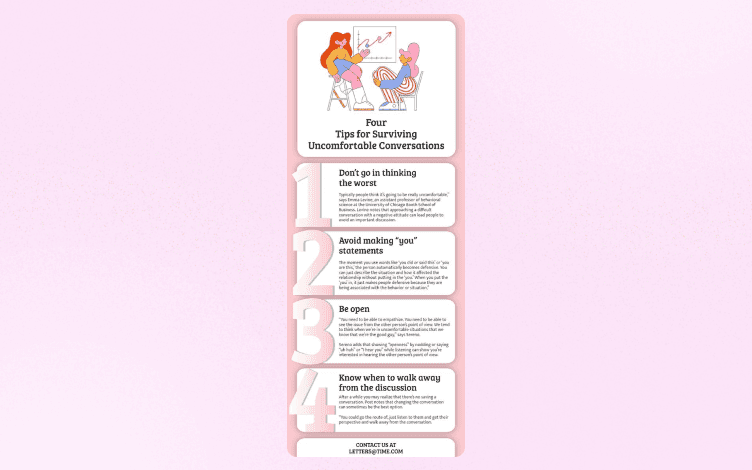
Listicle infographics
Comparative infographics
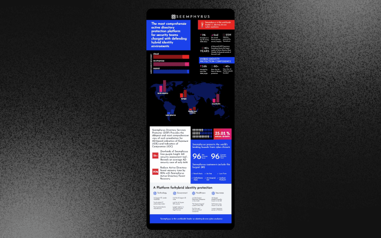
Charts & Statistical infographics
Visual infographics
Geographical & Map infographics
Timeline infographics
Informational infographics
1. Listicle infographics

Lists are the perfect way to give the consumer important information quickly. It allows users to glance over the content and understand the overall message or brief without needing to go into depth.
When writing a list for your audience be sure that everything in the list is a cohesive thought and relates to a single topic as a whole. They don’t necessarily need to follow a specific order unless you’re itemizing from most to least or in set criteria.
Listicle infographics, when designed well, tell a story and are easily understandable by any audience demographic.
2. Comparative infographics
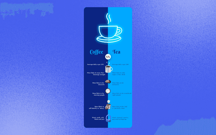
Distinctions and comparisons of information can be executed through simple data visualizations. When you use a comparative infographics layout you have options to use graphs, charts, or tables like with statistical infographics. It allows for a more creative outlet.
Using comparative infographics is best when there are two or more things to compare or when you want to compare large texts of information. Then sub-categorize into groups for comparison.
When to use it;
A perfect way for your audience to compare multiple products is through a buyer’s guide. Additional information about features and specifics are then grouped and presented side-by-side for consumers to consider which is best for them.
3. Charts and Statistical infographics
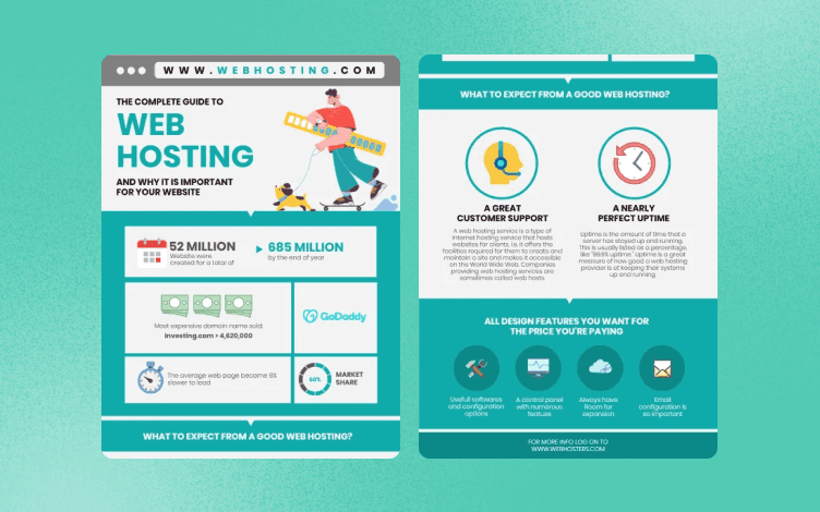
The main objective of chart infographics is to display data in a crisp and meaningful manner that allows the user to easily digest the information. The user can analyze the data from somewhat of an ‘aerial view’ without having to get into the finer details of the data presented.
Often companies prefer charts, as an image is easier to remember rather than large blocks of text. Colors also play an integral role where visually your statistics are quickly evident and help in the decision-making process.
4. Visual infographics
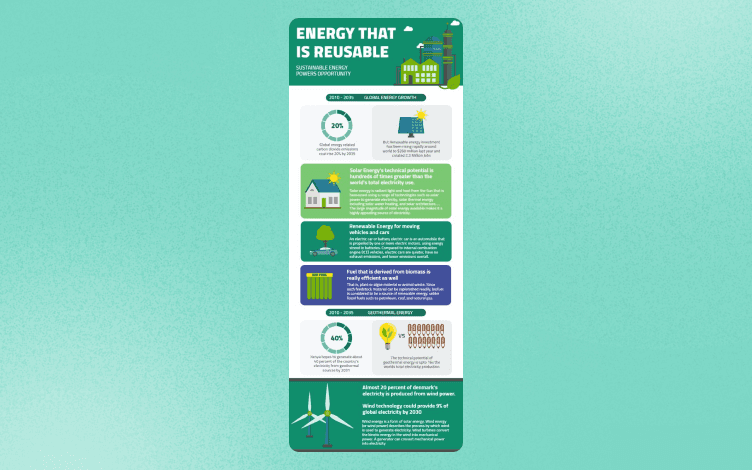
Grabbing the attention of your audience is easier done with visuals.
Visualization is a key factor in marketing where dense information can be shared more efficiently with its target market. While more complex blocks of information can be tricky to divide with multiple options, choosing the one which best communicates your point is always the better choice.
What is great about visual infographics is it allows for flexibility in the type of visualization aids you can use from Venn diagrams to pie charts.
5. Geographical & Map infographics
Geographical infographics are great when it comes to presenting demographic data, area statistics, or survey results.
These types of infographics are used to share information about or that is connected to geological locations. The information layout can then be elevated for even easier comprehension by using heatmaps, color codes, or population statistics.
6. Timeline infographics

Timeline infographics usually follow a single flow story where the evolution of a product or piece of information evolves and changes over time.
When you have visual elements in your presentation it evokes emotions from your audience which engages them even more.
One thing to remember when using timeline infographics is to keep how you present the time frames consistent.
For example; If you are explaining how a product was created in a specific year, as it evolved do not change the time frame layout to days or months. This will confuse your audience.
7. Informational infographics
Informational infographics are mostly comprised of lists and blocks of text rather than more visual options such as charts or graphs. They are, however, enhanced by using icons or a particular color scheme.
These types of infographics are mainly used when you want to introduce a new idea or concept. You can give your user an overview of a specific topic.
Interactive infographics explained
Interactive infographics are where a user becomes involved in your marketing platform by either scrolling or clicking on content. They are interacting with your website and brand products or services.
These types of infographics involve, and essentially require, human engagement for an action to be initiated. Interactive infographics do, however, come with a host of advantages that are beneficial to your company.
Let’s see the top 5 elements and how they could set your firm apart from the rest.
Engaging - When a user visits your site you ideally want them to engage with the content, interactive infographics allow for this. They can browse and scroll through the content at their leisure and explore the available information without feeling pressured. Studies have shown that by being involved in the various stages, consumers are more likely to go through with their purchase.
Attention-grabbing - Customers always enjoy feeling valued, and by them independently making choices through animation links or scrolling in a certain direction, this is easily achieved. When they are involved in part of the decisions you grab and maintain their focus.
Concise - Complex topics are more easily digested when consumers see animations or illustrations. You can offer a large amount of informational text, but present it in a concise and comprehensible format.
Uncommon - While this notion of implementing interactive infographics into your website is still novel, it will propel you one step ahead of the competition. This is a bespoke and unique method of communication.
Memorable - It is no secret that by doing, we remember. The same goes for online consumer browsing. When your audience is actively involved they are much more likely to retain the information they were presented with.
Catering to the needs of your audience in new and experimental ways will keep your brand and marketing strategy innovative. Creating web pages and content that is not only immersive but enjoyable, will leave a great lasting impression.
How do you create an interactive infographic?
To create quality infographics you want to create something that is not only memorable but is easy to understand. In just a few simple steps you will be well on your way to making your site interactively friendly for users.
Here’s how;
1. Choosing a template
Starting with a blank slate can be daunting but with so many template options available there is no need to be overwhelmed. Opt for a design that suits your style and which has an appropriate theme for the target market you want to reach. Think about whether you prefer vertical or horizontal diagrams or something in between.
2. Customization
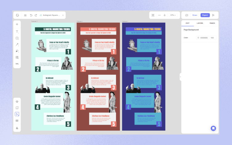
This is where your unique style and vision come to life. You can add or edit existing colors and formats, rearrange layouts to be more cohesive, and add images and specific fonts to bring it all together.
3. Adding the animations and interactivities
How you want your customers to engage in the platform will determine the interactive infographics you’ll need. From simple and easy-to-use, to more collaborative processes. Ideally, a successful interactive design has clearly defined goals, is easy to navigate, and offers an intuitive interface.
4. Complete and ready to use
Once the final edits have taken place and your conclusive draft has been ticked off, it is time to test the waters. Make it relevant to your intended target demographic, and take on feedback to refine any elements that could make it more successful.
Many companies, brands, and even schools and Universities are leaning towards implementing interactive infographics into their curriculum course works and firm policy pages. This is a tool that will set the tone for being an industry trendsetter, and others will soon follow.
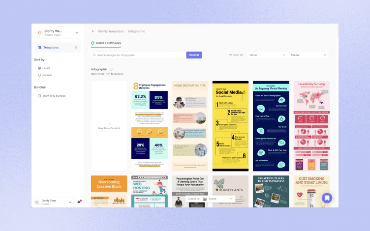
Free interactive infographic templates
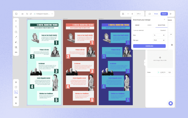
Making the most of free interactive infographic templates available on the Glorify, as a beginner in the industry, will save you a heap of time, and anxiety, and can get the job done with as high of quality were you to design one yourself.
The free templates are simple and effective to implement into current working platforms and web pages and make light legwork of what is seen as a heavy task.
Free interactive infographic templates bring a host of positives to get the ball rolling, let’s see how;
Finding yourself in a creative slump is something that happens to us all from time to time. Making the most of ready-to-use free interactive templates is not only time-saving but can be a great source of inspiration just to help kickstart ideas you may have mulling around.
If you have an idea of what you are looking for, when it is more specific like a geological or timeline infographic, there are dedicated templates available to ease the workload. These are usually already curated and put together, you only need to edit and tweak them to suit your audience and to convey your brand message.
Designing a webpage may not be everyone’s forte, thus, using infographic templates that are already designed and waiting to be used can be a blessing to industry novices.
Lastly, while these templates are free and quick to sort through, always consider the best quality template for your company. It is a reflection of your brand, and you want to ensure it stays well-designed.
At the end of the day
Incorporating various types of infographics into your current marketing strategy is a great way to transform your content and make it more appealing to a wider audience and consumer market.
When you are familiar with and become well-versed in the broad spectrum of what infographics involve, it can elevate your marketing campaign to a higher level.


Features
Alternatives


© 2019-2024 Glorify App - All rights reserved.