
We’re thrilled to announce that Glorify is officially partnering with Contra! This collaboration opens up exciting opportunities for designers, marketers, and creators in the Glorify community.
Posted Nov 9, 2022
•
7 min read

Design, Graphic Design, Entertainment

Create beautiful marketing graphics at scale.
Pepsi Logo History: What’s Behind This Iconic Symbol?


The Pepsi logo has a history of its own and we are here to explain them. Let’s cover the basics by knowing the facts below:
The Designers
The Pepsi logo has undergone a lot of changes in terms of its design and below are the people who influenced these designs in major ways.

Caleb Bradham
Rebranding the logo of Brad’s Drink in 1898 has stories behind them and some say it is a portmanteau of the words pepsin and cola. But, the official website of the company says that the pharmacist got the name “Pep Kola” from a competing brand which was later changed to the name we know today.
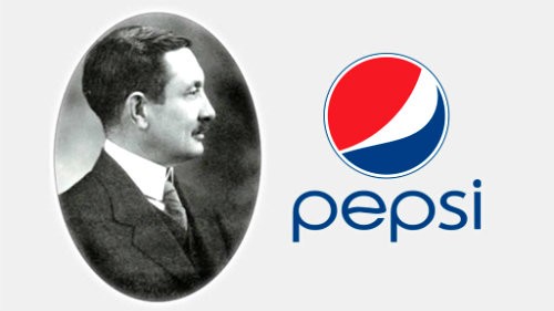
He then paired a new script logo himself that may look similar to other brands you know. The script had similarities with the wordmark of Coca-Cola whose logo was inspired by the Spencerian script.
Like any other entrepreneur, this small-town inventor had a knack for creating DIY logos that contribute to Pepsi’s logo history.
Arnell Group
He designed the Pepsi globe that became a polarizing topic in the industry. Few called it “nonsensical”, while the others claimed it to be a clever move. Say what so ever, it created a mark in the Pepsi logo history.
The company was closed down in the year 2013 after almost 30 years of operations.

Gerard Huerta
He specializes in typography, branding, and illustration and is the creator of the current Pepsi logo. This contemporary designer has worked with numerous big brands like Conde Nast, HBO, Bob Dylan, Adweek, Swiss Army Brands, and Calvin Klein.
Huerta took inspiration from the drink’s sleek packaging for redesigning the logo.

Pepsi Logo History: The Theory
Is dead?
Yes, you read that right. Consumers allegedly found this cryptic message in most of the brand Pepsi logos when the wordmark was read upside down it said, “isded”. Who was dead? What did it mean?
The internet regardless of the situation responded by discovering memes. To date, this logo is considered to be the most popular hidden symbol in brand logos.

1, 2, 3, Smile
The Pepsi globe logo that we have now is said to resemble a grin that makes the audiences connect to the drink with happy times and celebrations and is successful in drawing eyes to itself. There are other brands too that use this smiley face as a welcoming emotion in their logo like, Amazon, Argos, and Crayola among others.

The shockingly true story
The magnetic field, innovation, the golden rectangle is said to be represented through this new globe design. How do they connect to the fizzy drink? The company was said to redesign in a document people describe as “Da Vinci-esque.” The Arnell Group created a 27-page long design document that was strategically crafted to become viral and it worked. The Media outlets published various stories concerning the new globe and that Pepsi reportedly paid the Group a million dollars for its redesign.
Pepsi Logo History: The Timeline
Let’s now discuss the history of the Pepsi Logo-
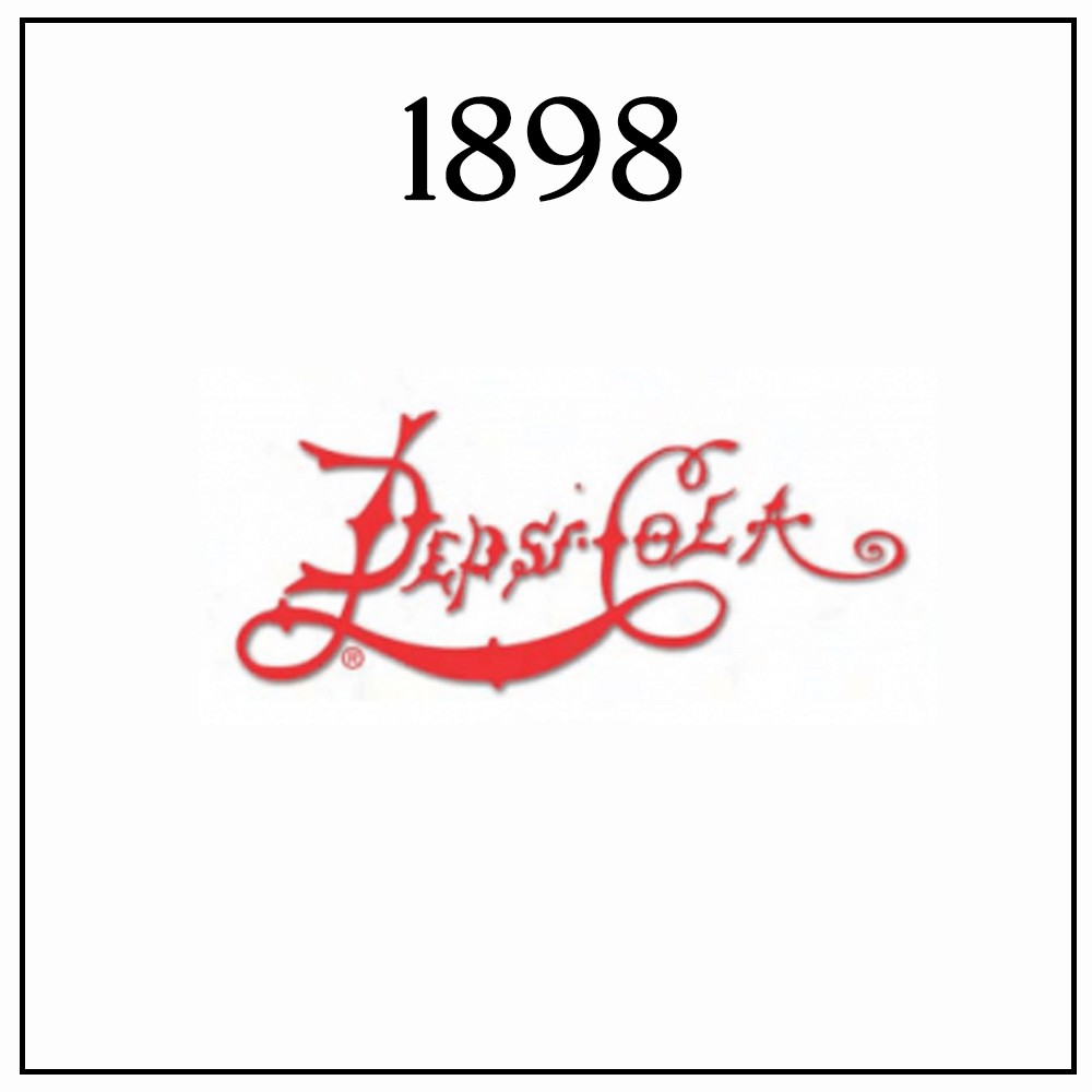
1898
The first logo of the drink was a spikey script wordmark that was designed by Caleb Bradham. The Pepsi logo was said to be hard to read as the glyphs had thin strokes and the space was small.
Those days hand-drawn logos were back and the brand’s competitor, Coca-Cola, got its logo through a DIY process from Frank M. Robinson who was the bookkeeper of the inventor.
1905
The brand eventually revised the design with broader strokes and the spike details were removed that made the design simpler and adaptive.
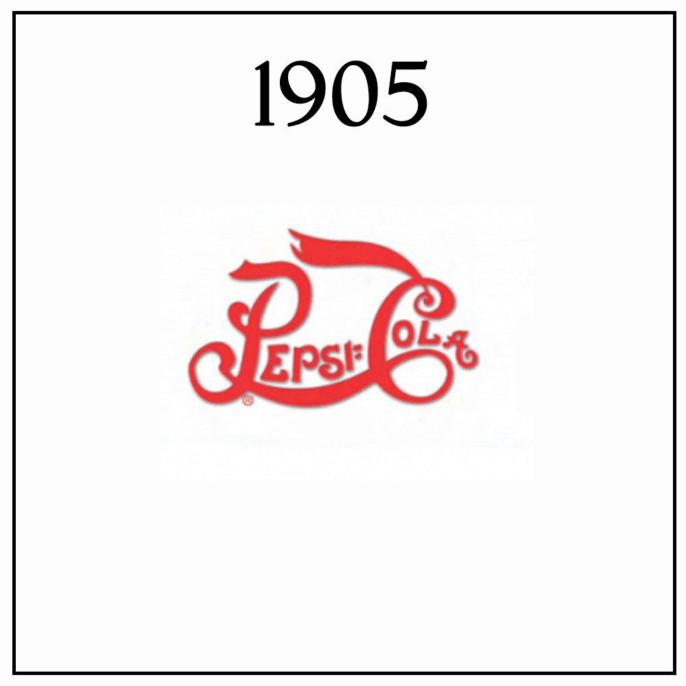
The edge of the letter C was hung dramatically as it added a dramatic flair to the design.

1940
The letters P and C got separate glyphs that resulted in refined typography. This font combination created a good contrast between the script and sans serif fonts.

1950
Now, Pepsi’s wordmark was no longer alone and the brand released a bottle cap logo. This served as a frame for the wordmark making it pop out even more. The illustration featured a new addition to the brand’s color scheme creating a lively design for the company.
The inclusivity was brought after the second world war as the brand’s efforts to connect to their country’s audience and world events.

1962
The world now bid adieu to the “cola” in the Pepsi wordmark to give it the name that is used to date.
The 1962 version was an eye-catching stamp symbol that adapted well and was easily incorporated in digital ads or on the printed label material. For the first time in Pepsi logo history, the logo was much readable now.

1973
The brand finally decided to omit the decorative border of the Pepsi logo. This gave way to the orb figure called the globe.
1991
The Pepsi logo redesign had a sporty feel to it and the Pepsi wordmark was taken out of the globe for good. The italicized text now was placed atop of the globe with a bold red line that added emphasis to the symbol.

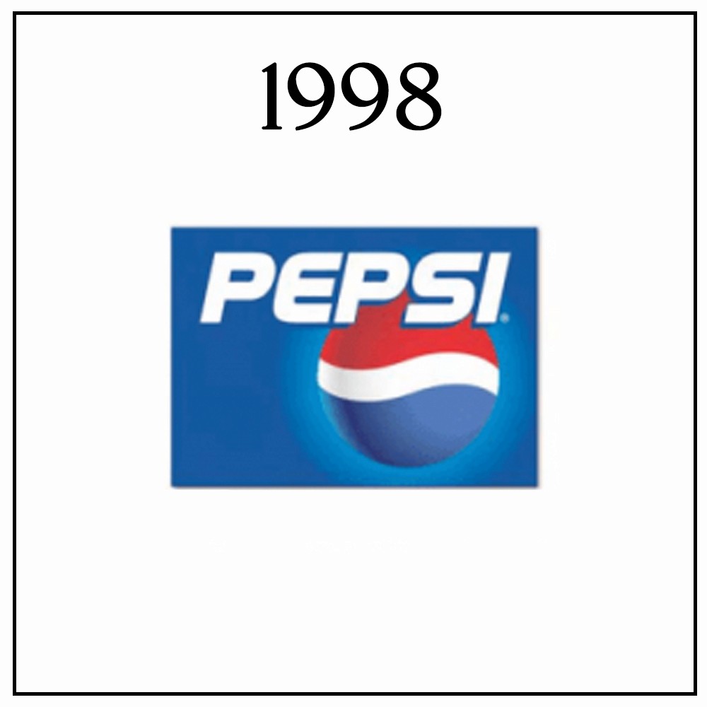
1998
To mark the company’s first century, a new logo was released with visual depth to it that caught the attention of audiences.
2003
The brand improved the depth by featuring new details that included the water droplets on the globe. Now, the globe was put atop the text that carried a lot of era-appropriate influences like the 3D and futuristic styles.

2008 to present day
The Pepsi logo now adapted a flat design movement from the 3D-inspired design, bringing an end to the transformations in the Pepsi logo history. Big brands like Google and BMW have redesigned their logo to create a crisp graphic mark. The Pepsi logo design now was designed by the Arnell Group while the typography is the work by Gerard Huerta called Pepsi Light. The Pepsi logo is seen as more legible and readable after going for a clean, two-dimensional logo and became more screen-friendly.
This Pepsi logo shows that the brand is not afraid to adapt and reinvent its look when the situation comes.

To conclude:
To survive the ever-changing market and consumer behavior, it is the responsibility of any brand to evolve. For more than a decade now the company has been a trusted brand around the world and has strategically changed over the years.
Pepsi Logo History FAQs
1) What does the Pepsi logo say?
Pepsi unveiled its new bottle cap that featured the script surrounded by red and blue colors on a white background and was recognized with its script. The cap logo was meant to show U.S. patriotism.
2) Which came first, Pepsi or Coke?
With a few years of difference, Coke came before Pepsi. Dr. John S. Pemberton invented Coca-Cola in 1886 while Pepsi did in the year 1893.
3) What does Pepsi mean?
The word ‘Pepsi’ means indigestion. It comes from the root word dyspepsia.
The word ‘Pepsi’ means indigestion. It comes from the root word dyspepsia.


Features
Alternatives


© 2019-2024 Glorify App - All rights reserved.